
Key Takeaways
- Illustrations should explain, guide, or reinforce the page message.
- Motion is most useful when it confirms an action, shows change, or directs attention.
- Decorative effects should never compete with navigation, copy, or calls to action.
- Accessibility and performance must shape visual decisions from the start.
- Simple testing reveals whether a visual helps users or merely adds noise.
Visual design can make a website feel memorable, but its most important job is to make the experience easier to understand. Designers exploring illustration UI examples can find useful inspiration, but the strongest work does more than look polished. It helps visitors recognize what a page offers, understand how it works, and take the next step with confidence.
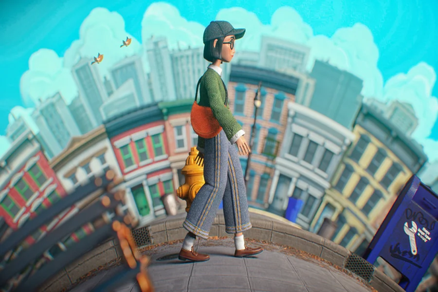
Illustration, motion, and dimensional visuals can give a digital experience personality and depth. They can also create confusion when they are added simply because a trend looks exciting. The best visual choices support a user task, preserve readable content, and leave people in control of how they move through the page.
1. Why Visuals Matter on Modern Websites
Most visitors scan before they read closely. They use headlines, spacing, color, imagery, and buttons to decide whether a page is relevant. Clear visual cues reduce that effort by showing the page’s structure and making the next action easy to spot.
Visual interest is valuable when it improves comprehension. Visual clutter occurs when several elements demand attention simultaneously. For example, a product page may benefit more from one labeled diagram that explains key features than from multiple decorative photos surrounding the purchase button. Good design supports the visitor’s task rather than competing for attention at every turn.
2. Choose the Right Role for Each Visual
Every visual element should have a clear job. Before adding a gradient, animated object, illustration, or 3D effect, ask: “What becomes easier for the visitor because this exists?” If the answer is unclear, the element may not be necessary.
Three useful visual roles
- Informative:Explains a product, process, concept, or outcome.
- Directional:Helps people notice a key action, locate the next step, or understand a relationship between interface elements.
- Atmospheric:Adds tone and brand personality without carrying essential meaning.
Atmospheric visuals are not automatically unhelpful. They can make a service feel warm, premium, playful, or trustworthy. They simply need to remain secondary to information and interaction.
3. How Illustration Can Support Content
Illustration is especially useful when a service is abstract, technical, or unfamiliar. A simple visual can show how an insurance claim moves through the review process, how software connects to a workflow, or what happens after a customer completes a form. Pair the illustration with nearby text so its purpose is understandable without relying on the image alone.
Use a consistent style across related sections. Repeating line weight, shapes, color choices, and character treatment creates a coherent experience. Hand-drawn details, bold shapes, and friendly characters can add personality, but they should not replace product specifications, instructions, pricing, or other information people need to make a decision.
Write alternative text with a purpose
Decorative images can use empty alternative text when they add no information. Informative illustrations need brief alternative text that communicates their purpose. Rather than describing every color and shape, explain the meaningful idea, such as “Diagram showing customer data moving from checkout to the inventory dashboard.”
4. When Motion Guides Users
Motion works best as interface feedback. It can show where a menu opened from, confirm that a form was submitted, reveal that a panel has changed state, or help users follow progress during a multi-step task. Small transitions make cause-and-effect easier to understand.
- Use short transitions for state changes.
- Show loading indicators when a delay is unavoidable.
- Use progress animation when it helps users track a task.
- Avoid movement that begins without a clear reason.
- Do not crowd one screen with several large animated elements.
5. Build With Accessibility First
Accessibility is not a final inspection step. It should influence illustration, animation, layout, and interaction choices from the first draft. Essential information must remain available in text, not only through color, position, or motion.
- Respect the environment and the surroundings.
- Check contrast for text, icons, buttons, and form controls.
- Ensure links and buttons work with a keyboard.
- Keep focus states visible when content changes.
- Avoid flashing effects and moving text that is difficult to read.
6. Protect Page Speed and Performance
Large images, video backgrounds, complicated 3D scenes, and heavy scripts can make a visually impressive page feel slow. Compress images, use modern formats where appropriate, and load below-the-fold media only when it becomes relevant. For simple interface feedback, lightweight CSS transitions are often more practical than large animation libraries.
Test on mobile devices and slower connections, not only on a powerful desktop computer. A useful rule is simple: if a visual effect takes longer to load than the content it supports, the design needs another pass.
7. Keep the Visual Hierarchy Clear
A strong hierarchy helps visitors answer three questions quickly: Where am I? What can I do here? What should I do next? Give the main headline and primary action the strongest visual position. Use scale, contrast, spacing, and motion with restraint, and keep decorative visuals away from navigation, form fields, and important instructions.
One dominant focal point per screen is often enough. As a practical review, remove images and disable motion. If the page still makes sense and the main action remains obvious, the hierarchy is doing its job.
8. A Simple Testing Process
- Write the purpose:Define what each illustration or animation should help users do.
- Review the static version:Confirm the page works without motion.
- Test the main task:Ask users to complete one important action.
- Check accessibility:Test keyboard use, contrast, text alternatives, and reduced motion.
- Check performance:Review loading time on mobile and slower connections.
- Remove one effect:Compare results after removing a decorative element.
Measure task completion, errors, time on task, and user comments instead of relying only on personal taste. A visually striking effect is successful only when it improves the experience without creating friction.
9. Common Mistakes to Avoid
- Adding animation before defining the user problem.
- Using a large hero effect that pushes useful content too far down the page.
- Making text move when visitors need time to read it.
- Using attractive illustrations that explain nothing.
- Relying on color or motion as the only status indicator.
- Ignoring touch targets, mobile layouts, and slow connections.
- Copying a popular visual pattern without considering the audience or task.
10. What 2026 Design Trends Suggest
Current illustration trends point toward more tactile, expressive, and human visual language. Imperfect textures, personal details, and less rigid forms can make a site more distinctive. Still, personality should never come at the expense of clear spacing, readable copy, and easy interaction.
Trends are useful prompts, not substitutes for research. Let them inspire a visual direction, then test whether that direction helps the people using the site. The most durable design choice is not the loudest one. It is the one that makes the experience clearer, faster, and more human.
Final Thoughts
Illustration, motion, and dimensional visuals can make a website more useful and memorable when every element has a purpose. Give visuals a job, protect the main task, offer accessible alternatives, and test the page without decoration. In 2026, thoughtful restraint will often make a stronger impression than visual excess.